
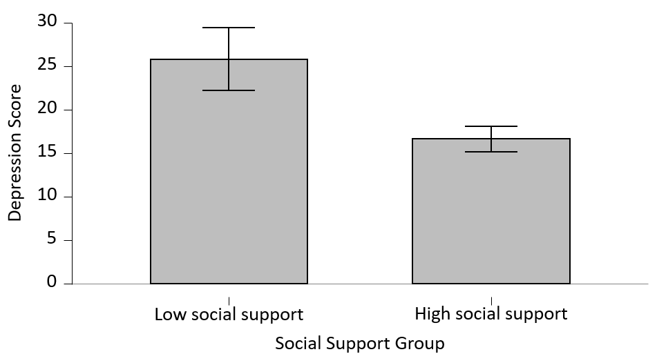
13 Exporting and Editing Plots from JASP
While you can create some excellent graphs with Excel, JASP allows you to export your plots (e.g., histograms) as images or directly into Microsoft PowerPoint.
This section will show you how to export plots directly from JASP and how you can edit them.
Exporting Plots as Images
The main benefit of exporting your plots directly from JASP is that you do not need to move your data to an Excel spreadsheet and spend time creating graphs from scratch.
Note: Using the method below will not allow you to edit your plots outside of JASP. This may be ok but many times there are requirements for how specific plots should look. An alternative method of exporting is covered further down in this section.
How do I do that?
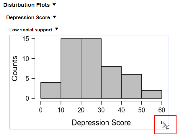
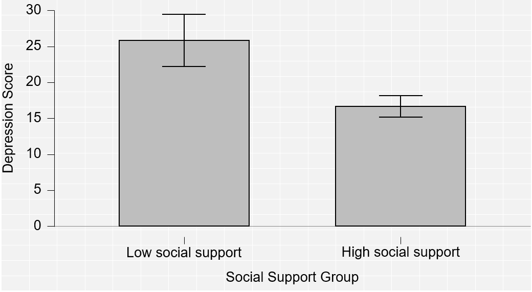
1. Once you have generated your plots(s), you can edit their dimensions by dragging at the corner of each graph, like so:
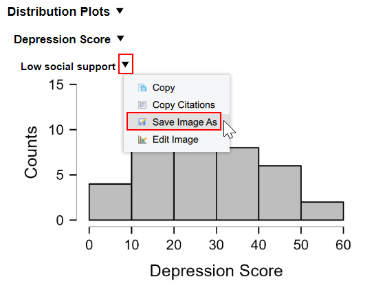
2. Once you have adjusted your graph to the desired size, click on the downward triangle (▼) next to the title of the graph and select Save Image As.
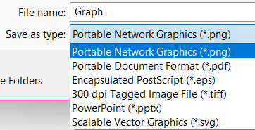
2. Save your image in the desired location. The default format is .png but you can select different file formats. We recommend the default file type.
3. You can then insert the image in another document such as Microsoft Word.
Exporting Plots as Editable Files
While exporting graphs as images is quick and easy, those images cannot be edited which may sometimes be required or preferable. For example, you may wish to add colour or adjust the graph so that it fully complies with the American Psychological Association (APA) formatting style. [1]
How do I do that?
1. Click on the downward triangle (▼) next to the title of the graph and select Save Image As.

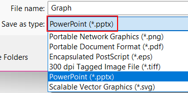
2. Save the graph in PowerPoint (.pptx).
3. Open your graph in Microsoft PowerPoint. It should look something like this:
4. Now you can edit your graph as you see fit or copy it directly into Word (or another document) by right-clicking on the graph, selecting Copy, and then pasting it into another document.
Editing JASP Plots in PowerPoint/Word
You can also edit JASP plots and tables in Microsoft PowerPoint and Word. To learn how to export plots, see the previous section.
An explanation of how plots/graphs (also referred to as figures) should be edited to be compliant with the APA style can be found on the APA Style Website.
Example
How do I do that?
1. Open your saved JASP plot in PowerPoint (or copy it from PowerPoint into Word).
2. Remove the background/grid – click twice anywhere on the background of the bar chart and press ‘Delete’. DO NOT click twice fast!
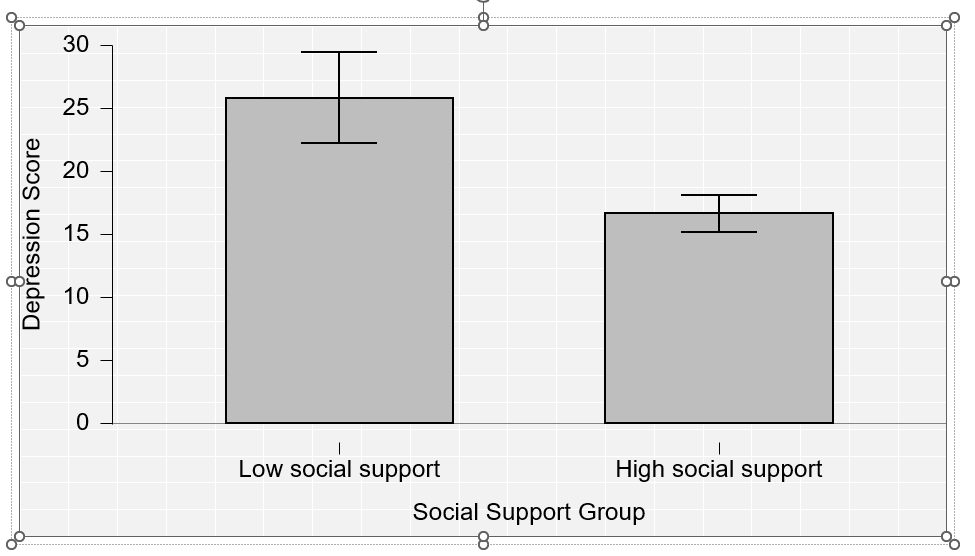
3. Click on the graph once. You should see a border around it, like so:
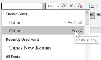
4. Next, adjust the font if it is not already APA-compliant. Select Calibri or Arial from the fonts drop-down menu. Adjust the size of the font as required.
5. You can move and edit any text on the graph by double-clicking the text boxes (invisible until clicked). You can also move the text anywhere on the graph.
Note: Depending on how you input your variables in JASP, this step may not be necessary. See the example below.
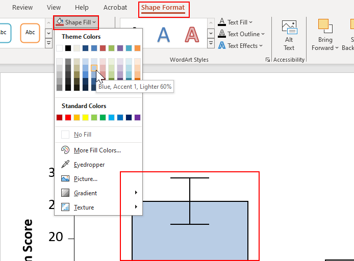
6. You can also change the colour of any element on the graph. For example, the colour of the bars. Click twice on the bar (or element) you want to change until you see a border around it. You should now be able to see a menu called Shape Format at the top of the document. Click on it and select your chosen colour under Shape Fill.
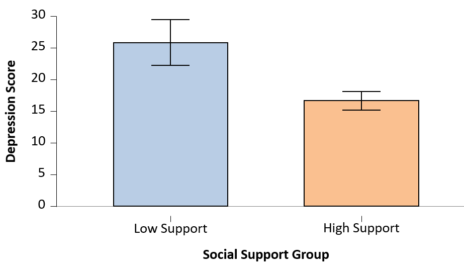
7. After you have done this for all elements, your graph should look something like this:
8. The final step is to label and title your graph. Under the Home menu, there should be a subsection called ‘Drawings’. Find it and select Text Box. Draw a text box anywhere. You can adjust font size and placement later. Label and name your graph, like so:
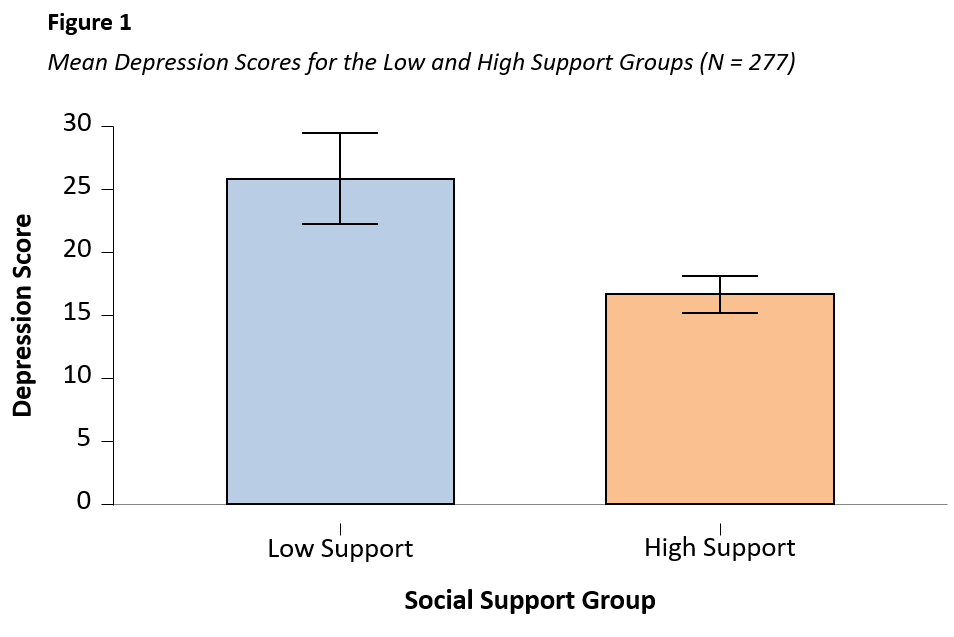
Note: In APA, all graphs are labelled numerically in the order in which they are presented in-text and are called ‘Figures’. The figures also require titles that describe the content of the graph so that the reader can understand what information is being presented.
- You can find out more about the APA style here: apastyle.apa.org ↵
