
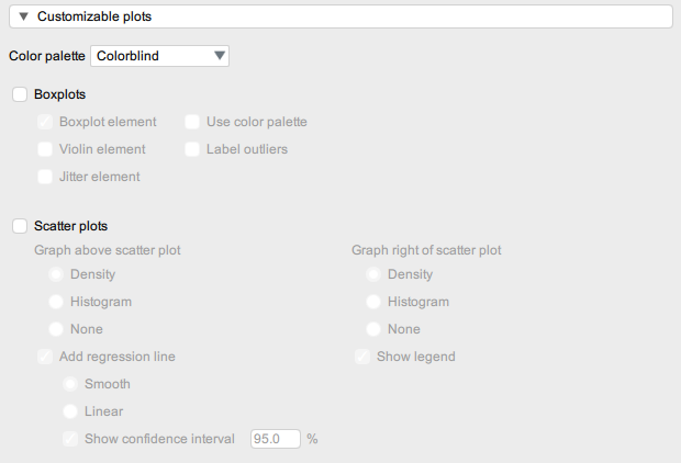
11 Customizable Plots
The third expandable menu in ‘Descriptive Statistics’ is called Customizable plots.
This menu is similar to the ‘Basic Plots’ menu but has additional options that allow you to further customize your graphs. There are two main sets of options relating to Boxplots and Scatterplots respectively.
Boxplots
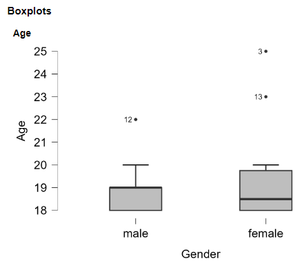
When you select Boxplots, the ‘Boxplot element’ is automatically selected (as without it, you have no boxplot!). Selecting ‘Label outliers’ is also useful as it provides you with the participant number (i.e., the row number) for any outliers.
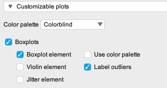
You can play around with your plot output by changing the colours or by adding extra elements such as:
- Violin element – overlays a line that represents the distribution of the data.
- Jitter element – overlays all of the data points.
Scatterplots
When you select Scatterplots, the default option includes additional graphs above the scatterplot. You may wish to change this option for the graphs to ‘None’.
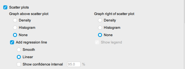
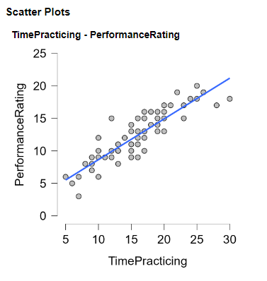
We recommend that you also select the following options which will help you to visualise the relationship between the variables:
- Add regression line
- Linear
