10 Basic Plots
The second expandable menu in ‘Descriptive Statistics’ is called Basic plots.
To see the options in this menu, click on ‘Basic plots’. You can then select which types of plots (i.e., graphs) you want to appear on the right-hand side of the screen. Remember that you can always unselect options in JASP so do not be afraid to experiment.
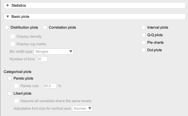
Here are some of the most common plots/graphs you are likely to use as a Psychology student:
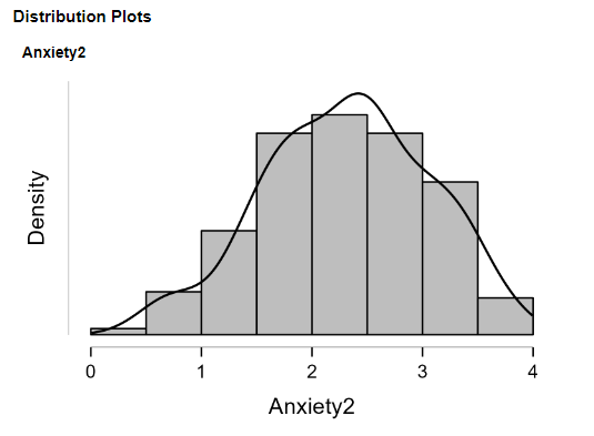
1. Distribution plots (i.e., histograms)
When selecting distribution plots you may also want to select Display density as this overlays a line that will help you assess the normality of the distribution visually.
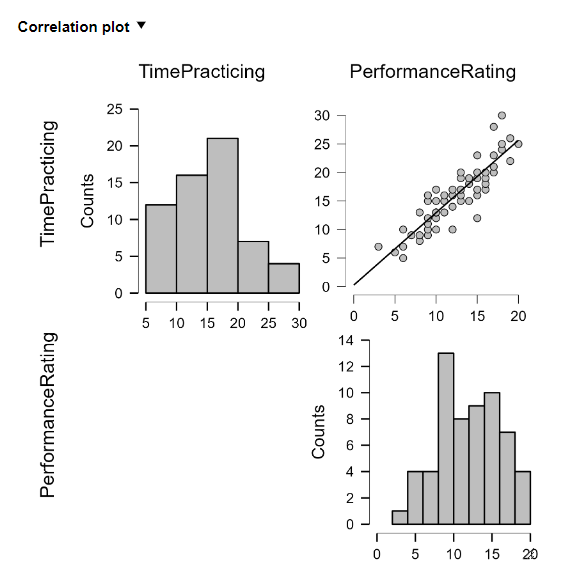
2. Correlation plots (i.e., scatterplots)
Selecting correlation plots will give you both a scatterplot and a histogram. There are other options for creating scatterplots which are covered in Section 11.
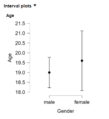
3. Interval plots (i.e., error bars)
Interval plots will allow you to see the distribution of the data around the mean. This is particularly useful when comparing two groups or conditions.